Sedcards
First impression counts
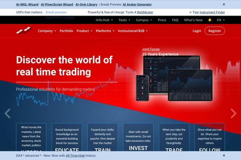
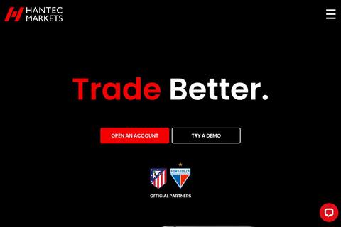
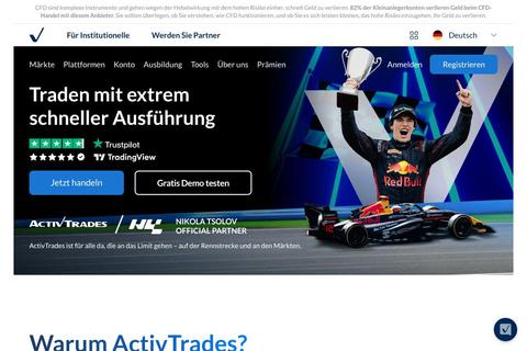
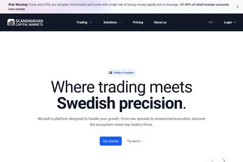
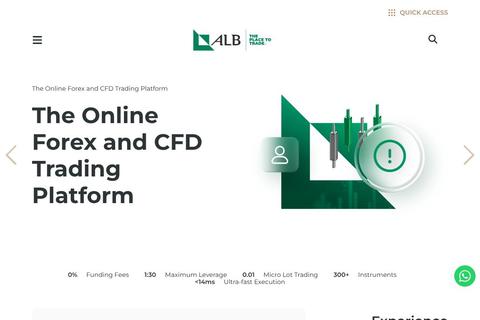
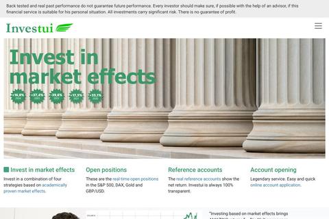
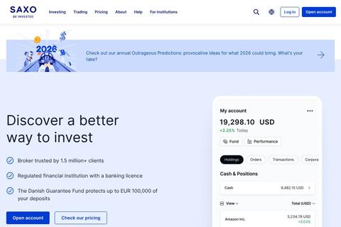
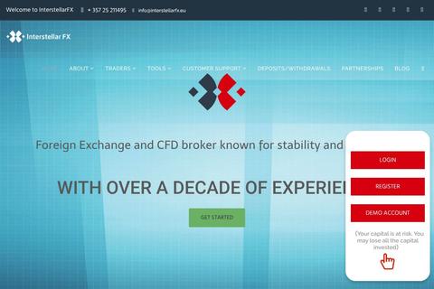
You are certainly familiar with this from presentation documents in the areas of fashion or models at agencies, magazines or photographers. In our 'Sedcards' overview, we take up this idea and give you the opportunity to quickly get a first visual overview of how well or not so well financial service providers succeed in visually appealing to you as a potential prospect. The interaction of visual elements with well-prepared information is the PItch that significantly contributes to whether the choice falls on one provider or another.
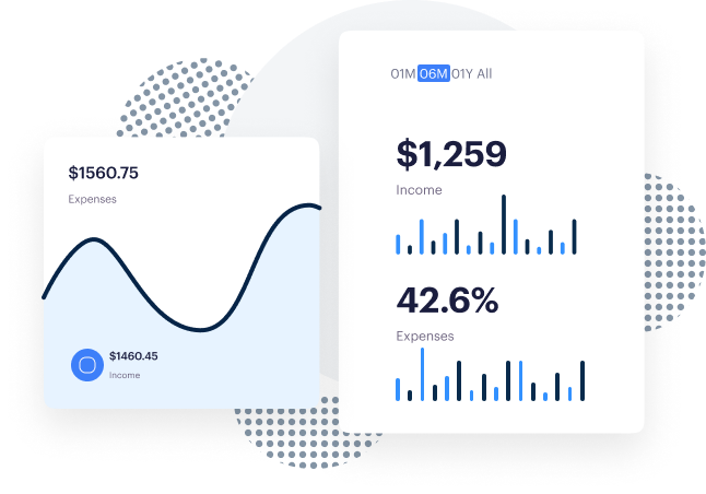
We have received a number of suggestions for improvements to the Equity Curve Simulator. Since some of the interested parties did not leave us an email address, we are tracking the implementation of the feedback in the forum.
You might be interested in the following
Trading Platforms · Product Universe · Social Trading Provider
Isn't it perhaps also about something more ....?
Interest should also be aroused in the departments responsible for the external appearance and thus the visual communication of the companies. As seen from a cursory browse through the catalogue, some websites stand out visually positively. Others, on the other hand, appear staid and rather unappealing. This pool is a playground without equality for marketing experts and design agencies.
Companies that are in the process of repositioning themselves or are confronted with the challenges of the optimal look and feel - the corporate design ("CD") - could look like, maybe inspired here by more than 250 individual examples.
You will quickly discover that some companies work with great attention to detail, defining intuitive user guidance and page navigation as a central element of improving ease of use and the user experience.
Others prefer standard templates that are not particularly appealing and do not exude character or charm.
Even though 'look' depends on subjective factors, it should not be underestimated. Ultimately, an appealing internet presence is usually the end of a long, elaborate development process that often stretches over several months and ties up many resources. Anyone serious about customer acquisition and interested in a lasting customer relationship will always strive to clarify this to the outside world. Lessons learned: As the old saying goes, "the eye is in the game".
The sedcards are updated monthly. So it's worth checking back regularly.
In Q4/2022, the development of a mobile version of DDH is planned, with which users can navigate comfortably through the complete catalogue of providers. Further information is available in the roadmap or on the product information page.


